With this MicroStrategy Dashboard, we can easily answer the 5 questions from our data set, Income Tax Data.
1. Which of the 3 Stages in the US that have the most number of Counties? (Attributes: State Postal Code, County Name)
To find the state which has the most number of counties, we used State Postal Code and County Name as attributes. The reason why we used Heat Map instead of a pie chart is because the United States has 51 states. The pie chart is not a proper visualization tool to find a proportion because we would have to divide up the pie chart into 51 slices and the slices would be difficult to compare visually. However, heat map can present 51 states using many rectangular shapes; this way it is easy to find the top 3 states.
This chart shows the state which has the most number of counties in the top left corner and the state with the second-most number of counties is just below the top left corner. The states are ranked in this order from top to bottom then left to right. At the end, the state which has the lowest number of counties is located at the right bottom corner. Because of this ordered presentation, we can easily find out the top 3 states in terms of the number of counties which are Texas, Georgia, Virginia. We can also easily find the number of counties as well by moving the cursor to a block representing the state where we want to know the number of the counties. For example, as you can see in the picture above, Iowa has 100 counties in its state. We learned that this chart is better at presenting a large number of divisions than a pie chart.
2. What are the top 5 State that have the highest Wages and Salaries Income? (Attribute: State Postal Code; Metric: Wages and Salaries Income)
To answer this question, we used the attribute State Postal Code and metric Wages and Salaries Income. We also used Bar Graph to illustrate for the question due to the data required. The vertical axis shows the number of income generated in each of these top states while the horizontal axis shows the state postal code by alphabet order.
By looking at this graph, we can tell the top 5 states in the U.S that have the highest wages and salaries income and how much income each state has. For example, California (CA) stands in the top of generating wages and salaries income every year with average of $1.34 billion and Texas (TX) ranks after CA with $7.75 million.
3. Which state is doing better in generating adjusted gross income between Florida and California? (Attribute: State postal code; Metric: Adjusted Gross income)
We used Adjusted Gross Income for metric and State Postal Code for attribute to answer this question. We chose Pie Graph for this question because it helps us easy to compare between CA (California) and FL (Florida) about their Adjusted Gross Income made in each state. The conclusion and insight we can draw from the visualization is from the pie graph we can see that CA have a higher Adjusted Gross Income than FL with 68.06% compare to 31.94%. Although, FL is a tourist destination but they still have less Adjusted Gross Income than CA, which is 36.12%. In conclusion, looking at the pie graph we can see that CA is doing better than FL.
4. How much interest does each county receive within New Hampshire? (Attribute: County Name; Metric: Interest Received)
To get the insight from the dataset in terms of interest received for any given state of the U.S, in this situation, New Hampshire, we used County Name (New Hampshire) for Attribute and Interest Received (New Hampshire) for Metric. The Scatter Plot Chart was selected instead of other types of visualization because it enables viewers to get a quick comparison of interest received between a large numbers of counties. Each dot represents a county with specific position in the chart that reflects how high/low each county’s received interest amount is.
By looking at the graph, the interest received amount of each county in New Hampshire is shown as well as comparison can be made between these counties. For example, there are 4 counties likely to have similar interest received such as Belknap County, Carroll County, Cheshire County and Strafford County. Besides, Hillsborough County has the highest interest received among all counties in New Hampshire. These are some conclusions can be withdraw from the visualization. Moreover, the big difference between highest and lowest county’s interest received (Coos County and Hillsborough County) can be analyzed to find out the reasons in order to adjust or fix any error that maybe occurs when doing tax return. It can be an insight from analyzing the chart.
5. What are the top 5 counties that have the lowest number of exemptions in California? (Attribute: County Name; Metric: Number of Exemptions)
We used County Name as Attribute and Number of Exemptions as Metric to answer this question. Also, we used Bar Graph to illustrate for the question due to the data required. The vertical axis shows the County Name, and the horizontal axis shows the Number of Exemptions. We decided to choose the bar graph for this question instead of the other types of visualization because we can choose to see the number of counties that have the lowest/highest number of exemptions in California.
With this graph, we can easily choose to see the top 5 counties that have the lowest Number of Exemptions. Thus, we can see that those 5 counties are Alpine County, Modoc County, Mono County, Sierra County, and Trinity County. Also, you can change the number of counties in the stage you want to see. In conclusion, we learn that bar graph is better at presenting the top highest/lowest number of objectives that you want to see than any other types of visualization.
Monday, April 7, 2014
Friday, March 28, 2014
Dashboard
What is a dashboard? (Janssen)
Dashboard is a data visualization tool that provide the current data of metrics, statistics and key performance indicator (KPIs) for an enterprise. Dashboard shows the users how well a business is performing, based on the current data of the business.
Dashboards are mostly used by the management department so they can see the snapshot of all the important data that are needed to create accurate business analysis.
There are many types of dashboards, but Analytical and Operational Dashboards are the most popular ones.
Analytical Dashboards - focus on gaining insights from a volume of data and support interactions with data, drilling down into the underlying details. The data was collected over time - usually the past month or quarter. They use this to understand what happened, why, and what changes should be made in the future.

Operational Dashboards - manage intro-daily business processes, frequently changing and current performance metrics or key performance indicators (KPIs)

What is the role of dashboards in business intelligence? (Business Intelligence and dashboards in general)
1. Supporting Enterprise Information Portals
Efficient management is crucial especially for bigger companies since they have tremendous data for the company. The company stores data at one place which makes it easier to get all data for manager when they need it immediately. Thus, Enterprise Information Portal (EIP), which is an answer for all data integration needs, is used by many companies increasingly.
From a technical point of view, EIP is a framework aiming to gather crucial data about the company. Different data from all departments, information about employees, and operational processes specifications are putted together using EIP. However, EIP requires a separate tool, which would be a dashboard, to operate these. That is the role of dashboard. EIP would efficiently accelerate data flow and information spread if it is supported with dashboards.
2. Facilitating Strategy Invention
After selecting data and operating information, conclusions and predictions should be made for the data and information. We can call the result a strategy. The role of the dashboard is to facilitate strategy creation using twofold tools, scorecards and strategy maps.


Many businesses have a large volume of data that needs to be processed and kept in stock for years. In cases such as theses many users can benefit from the use of strong powerful dashboard applications, which allows saving and processing larger number of data.
By delivering key performance indicators in a highly graphical visual interface, dashboards give business users the critical information they need to understand and improve organizational performance.

As we know that dashboard is the tool that businesses use to track the business progress so that they are able to measure their business 's performance over a period. In other words, dashboard can help businesses adjust their performance based on provided data on time to compare effectively in the market. There are some main advantages of dashboard in business:


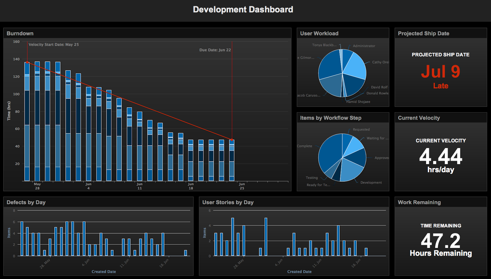
 This dashboard tracks level of defect of products over time. High defect will lead to lower production immediately.
Dashboard is a data visualization tool that provide the current data of metrics, statistics and key performance indicator (KPIs) for an enterprise. Dashboard shows the users how well a business is performing, based on the current data of the business.
Dashboards are mostly used by the management department so they can see the snapshot of all the important data that are needed to create accurate business analysis.
There are many types of dashboards, but Analytical and Operational Dashboards are the most popular ones.
Analytical Dashboards - focus on gaining insights from a volume of data and support interactions with data, drilling down into the underlying details. The data was collected over time - usually the past month or quarter. They use this to understand what happened, why, and what changes should be made in the future.
Operational Dashboards - manage intro-daily business processes, frequently changing and current performance metrics or key performance indicators (KPIs)
What is the role of dashboards in business intelligence? (Business Intelligence and dashboards in general)
1. Supporting Enterprise Information Portals
Efficient management is crucial especially for bigger companies since they have tremendous data for the company. The company stores data at one place which makes it easier to get all data for manager when they need it immediately. Thus, Enterprise Information Portal (EIP), which is an answer for all data integration needs, is used by many companies increasingly.
From a technical point of view, EIP is a framework aiming to gather crucial data about the company. Different data from all departments, information about employees, and operational processes specifications are putted together using EIP. However, EIP requires a separate tool, which would be a dashboard, to operate these. That is the role of dashboard. EIP would efficiently accelerate data flow and information spread if it is supported with dashboards.
2. Facilitating Strategy Invention
After selecting data and operating information, conclusions and predictions should be made for the data and information. We can call the result a strategy. The role of the dashboard is to facilitate strategy creation using twofold tools, scorecards and strategy maps.
3. Dashboards' real value reporting
Dashboards
are definitely helpful with reporting. However, disputes remain when they do
not reflect data changes immediately. This is the dashboards’ significant
restriction. Data becomes outdated automatically when data coming from external
sources are refreshed once. However, dashboard can be used for analysis which
demands encountering with timely data. It is obvious that more detailed reports
make managers confident to make decisions.
- Analytical features of today's dashboards
- Since analytical insight is one of the most crucial parts of performance management, most dashboards answer quickly to the most relevant questions. These days, dashboards contain everything, which makes dashboards the most powerful source of business intelligence.
- Planning within dashboards
- Dashboards support planning and budgeting processes while other softwares do not offer these features. Thus, when managers use dashboards properly, they can take benefits from dashboards to organize their business more efficiently.
How can dashboard help with Big Data? (Pentaho)
Many businesses have a large volume of data that needs to be processed and kept in stock for years. In cases such as theses many users can benefit from the use of strong powerful dashboard applications, which allows saving and processing larger number of data.
By delivering key performance indicators in a highly graphical visual interface, dashboards give business users the critical information they need to understand and improve organizational performance.
Dashboard features include:
Portal and mash-up integration to seamlessly
integrate business analytic with other applications, including Google Maps- Rich graphical visualizations with navigation, drilling and a rich library of filter controls
- Web-based drag and drop dashboard design functionality for business users
How are dashboards useful in business? (Tableau)
As we know that dashboard is the tool that businesses use to track the business progress so that they are able to measure their business 's performance over a period. In other words, dashboard can help businesses adjust their performance based on provided data on time to compare effectively in the market. There are some main advantages of dashboard in business:
1. Understand your business at a glance:
Businesses do not need to review tons of transaction papers for everyday but just simply take a look at the dashboard which gives them the "snap-shot" of their business's performance. The information can tell either your business is doing well or in emergency level and need quick modifications.
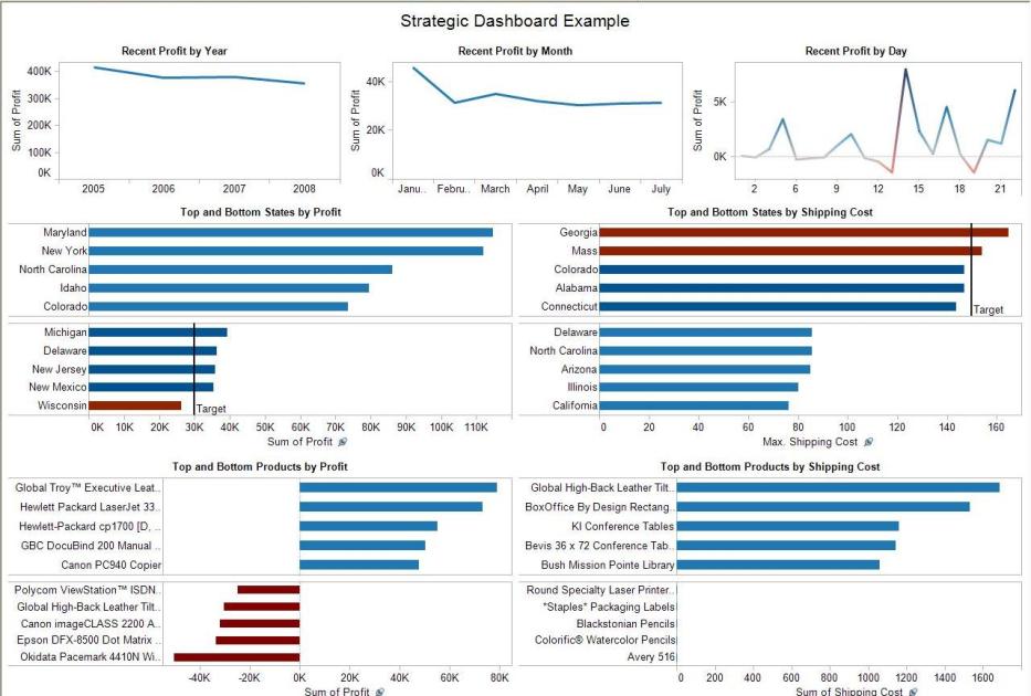
This first dashboard is providing profitability from geography, product categories and customer segments (Tableau)
The second dashboard is focusing on products. It shows which product categories are most sold, highest profit, which month has high sales, etc. (Tableau)
The last dashboard is focusing on the customers. It gives some useful data such as which regions have highest customers/profits/sales/profit ratio, etc. (Tableau)
In overall, each visualization enables you to filter out appropriate information to identify problems as well as opportunity to take advantages on.
2. Provide software to track issues before it's uncontrollable:
Being ahead of the issues and manages it when it's possible is the way to save business money and prevents big problems in the future. Dashboard can combine multiple of data sources such as operator inputs, sensor data or real-time systems.
3. Bring useful information to users quickly, accurately and visually:
Dashboard can present several of information visually within a dashboard, so the users can find their wanted data or answer their questions quickly and easily. Dashboard can be used to figure out the problems or provide the background of the industry for analyzing. By looking at the trends, facts and number visually, it enables business to access to necessary information to make suitable decisions.
References:
BI Dashboard(2014). Business Intelligence and dashboards in general. (n.d.). Retrieved from BI Dashboards:
http://www.bidashboard.org/bi/role-of-dashboards-in-business-intelligence.html
http://www.bidashboard.org/bi/role-of-dashboards-in-business-intelligence.html
Janssen, C. (n.d.). Business Intelligence
Dashboard (BI Dashboard). Retrieved from Techopedia:
http://www.techopedia.com/definition/13773/business-intelligence-dashboard-bi-dashboard
Pentaho (n.d.). Big Data
Analytics. Retrieved from
Tableau.
(n.d.). Business Dashboard. Retrieved from
http://www.tableausoftware.com/solutions/business-dashboards
What enterprise and activity does your data set represent?
Our dataset, Income Tax Data, represents the data collected from different Counties Income in different States, including Number of Returns, Number of Exemptions, Wages and Salaries Income, Dividends before Exclusion, and Interest Received of each County. This set of data gives us the insight of the Income Tax of the country, which helps us to determine which county/state has the highest/lowest Salaries Income or Number of Returns. Therefore, this insight helps us to know whether the changes are needed in each county/state to make the Income Tax of all the states equally.
What are the five questions you have asked of your dataset? For each of the five questions, what are the attributes and metrics you are relating to provide you with insight?
Based on our dataset, Income Tax Data, we have come up with five questions that provide us with insight of this dataset:
- Which of the 3 Stages in the US that have the most number of Counties? (Attributes: State Postal Code, County Name)
- What are the top 5 State that have the highest Wages and Salaries Income? (Attribute: State Postal Code; Metric: Wages and Salaries Income)
- Which state is doing better in generating adjusted gross income between Florida and California? (Attribute: State postal code; Metric: Adjusted Gross income)
- How much interest does each county receive within New Hampshire? (Attribute: County Name; Metric: Interest Received)
- What are the top 5 counties that have the lowest number of exemptions in California? (Attribute: County Name; Metric: Number of Exemptions)
Subscribe to:
Posts (Atom)